In the crowded health insurance market, GMHBA faced a critical challenge – many consumers didn’t understand their value proposition. That was until their breakthrough “Caring Since 1934” campaign tapped into the brand’s little-known origin story…

Best Brand Campaign | Financial Markets
Best Brand Campaign | Not-for-Profit
Best Brand Campaign | Healthcare & Pharma
Best Brand Campaign | Insurance

Best Brand Campaign | Real Estate
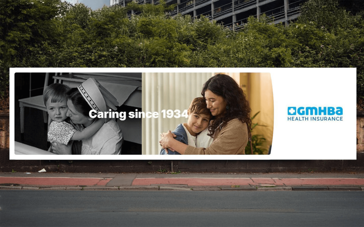
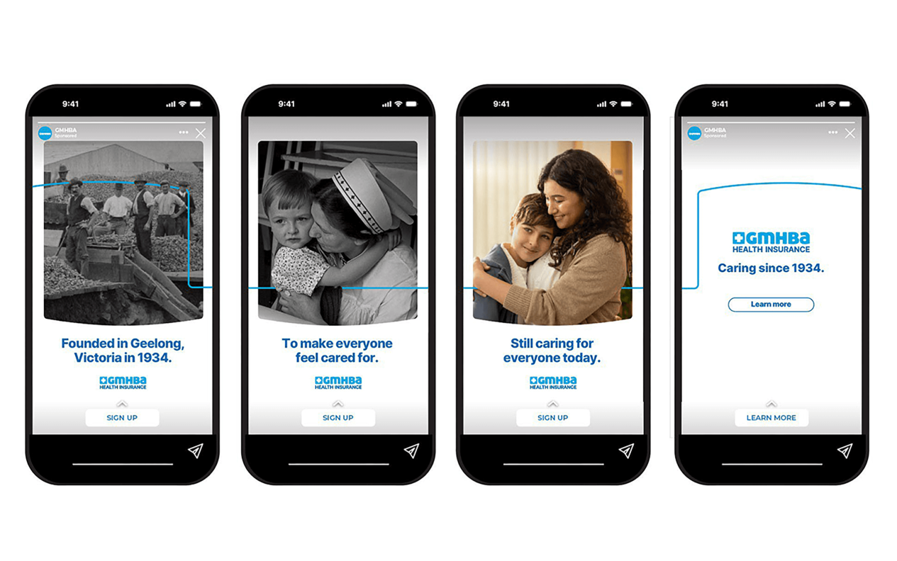
In the crowded health insurance market, GMHBA faced a critical challenge – many consumers didn’t understand their value proposition. That was until their breakthrough “Caring Since 1934” campaign tapped into the brand’s little-known origin story. Historically GMHBA were known as champions of working-class Australians. They cleverly transformed this historical legacy into modern competitive advantage. By reframing their 1934 roots as proof of enduring values rather than pure nostalgia, GMHBA achieved remarkable results: 36% of consumers gained clearer understanding of their mission, while emotional connection scores jumped, with many specifically recognizing GMHBA’s caring ethos as distinctive. The campaign’s authentic storytelling drove tangible business outcomes too – far higher consideration intent and significant increases in website/call engagement. This is a great result for an industry often reduced to transactions and proof that genuine heritage builds trust. Rather than just selling policies, GMHBA demonstrated how 90 years of consistent care creates brand equity and gives health insurance a much-needed human face while strengthening its market position.

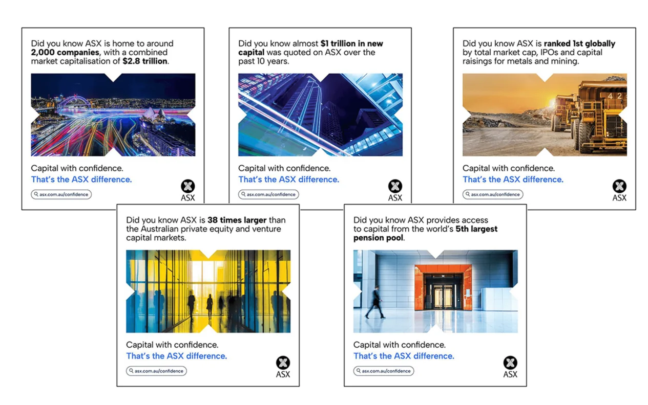
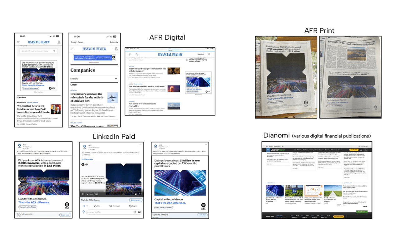
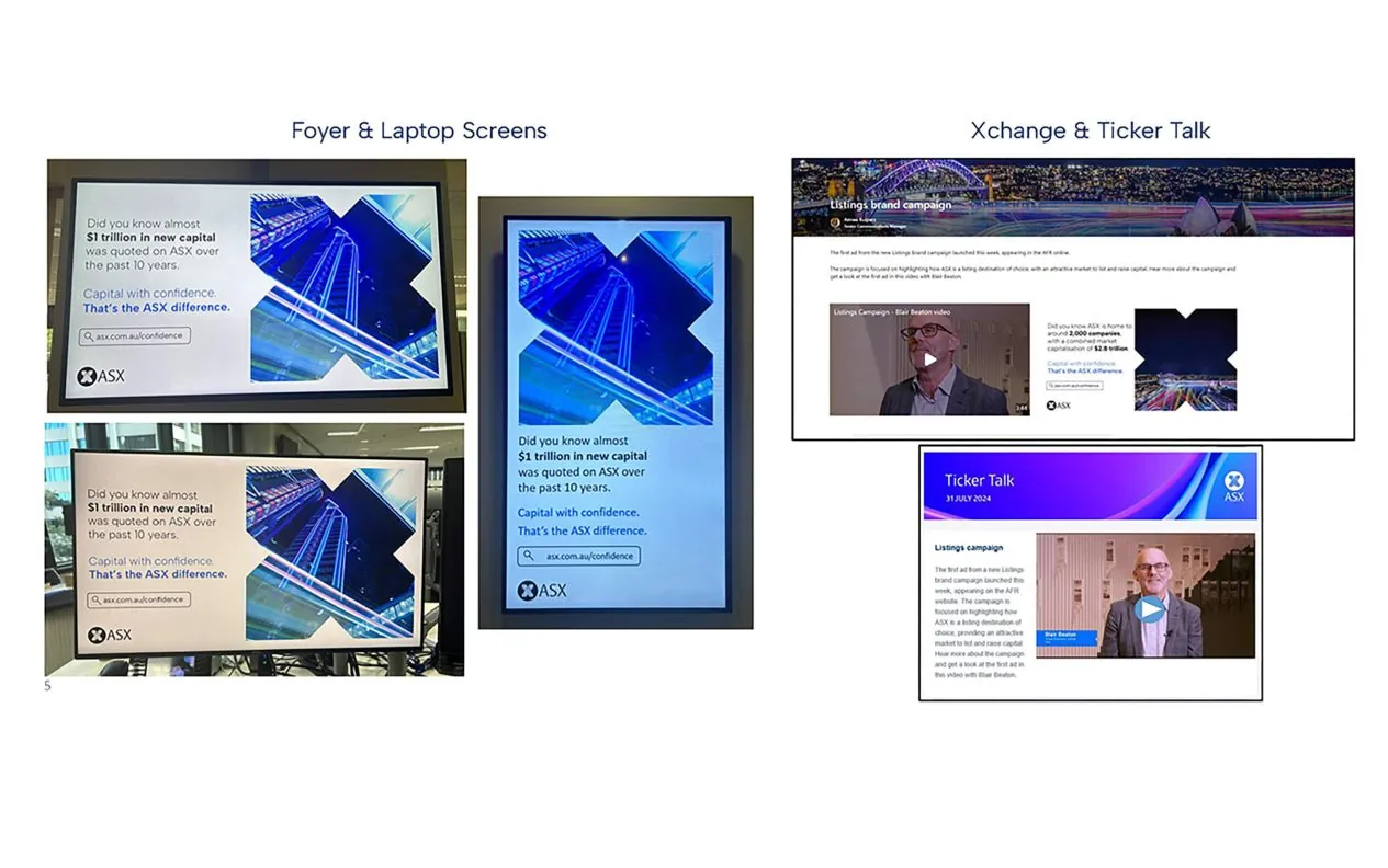
When negative narratives threatened to overshadow the Australian Securities Exchange’s (ASX) strengths as a global listings destination, the exchange responded with its groundbreaking “Capital with Confidence” campaign. Facing unprecedented challenges – from budget constraints to an untested in-house creative team – ASX delivered a masterclass in strategic repositioning.
The campaign’s multi-channel approach, spanning targeted LinkedIn ads, international roadshows, and innovative public installations at Exchange Square (ASX HQ), drove remarkable results. Brand perception scores rose steadily on Reptrak’s index, while listings website traffic exploded, with new visitors accounting for the majority of the surge. The team’s resourcefulness shone through in every aspect, from achieving an impressive cost-per-click to transforming corporate headquarters into a public engagement hub that drew crowds and social media attention. Perhaps most impressively, the campaign’s success extended beyond metrics – it equipped the ASX listings team with powerful talking points for international pitches and created visible momentum that helped counter broader market skepticism. In an environment where confidence was scarce, ASX demonstrated how strategic marketing could become a competitive advantage for an entire financial ecosystem.
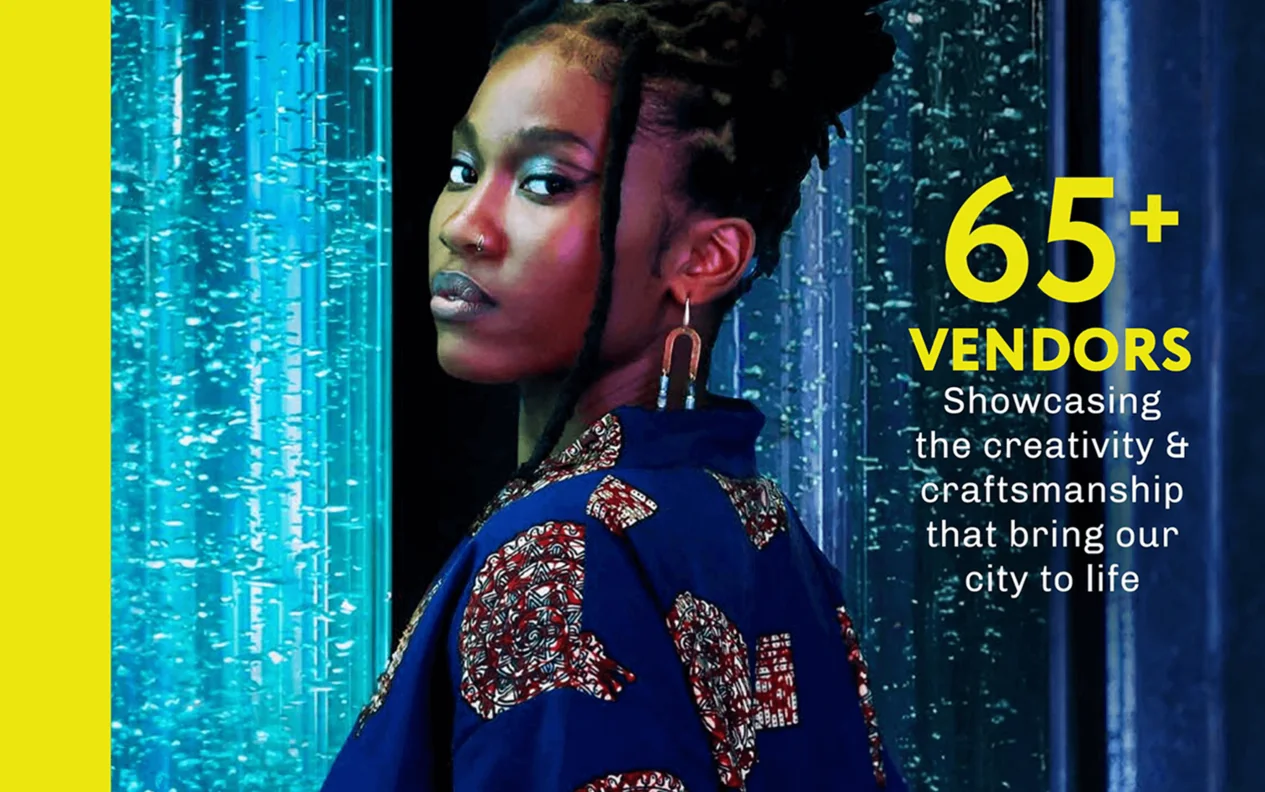
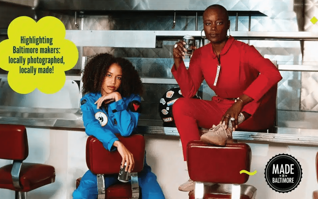
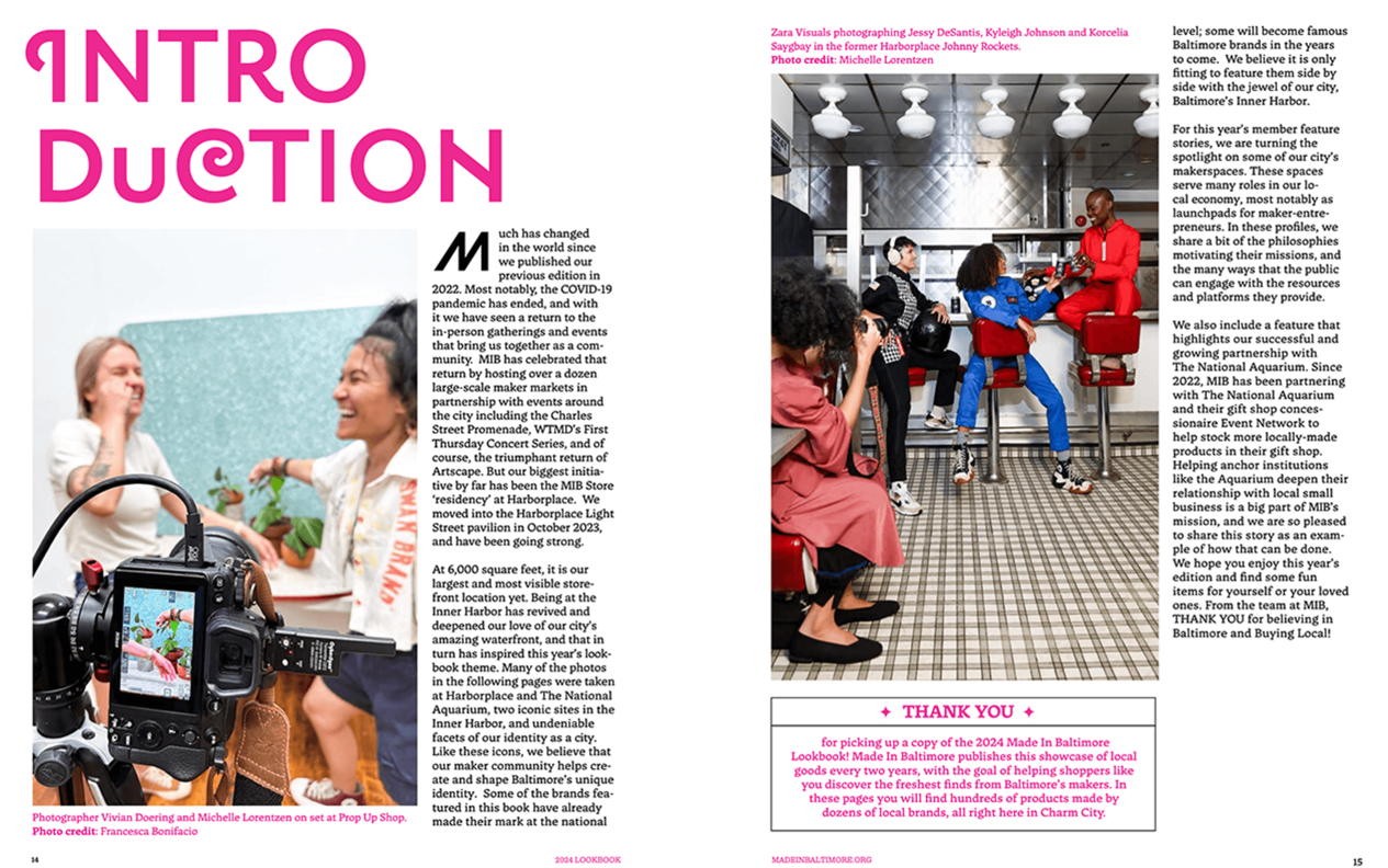
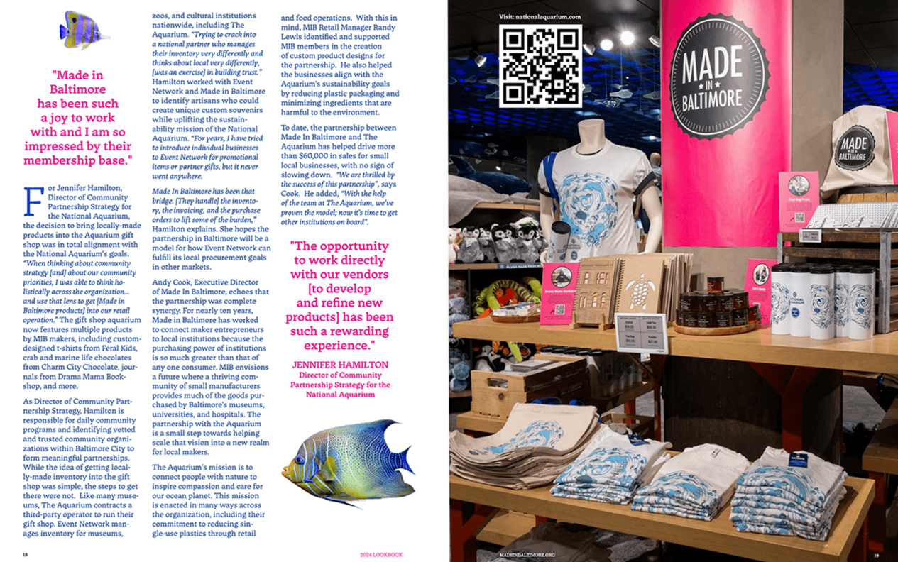
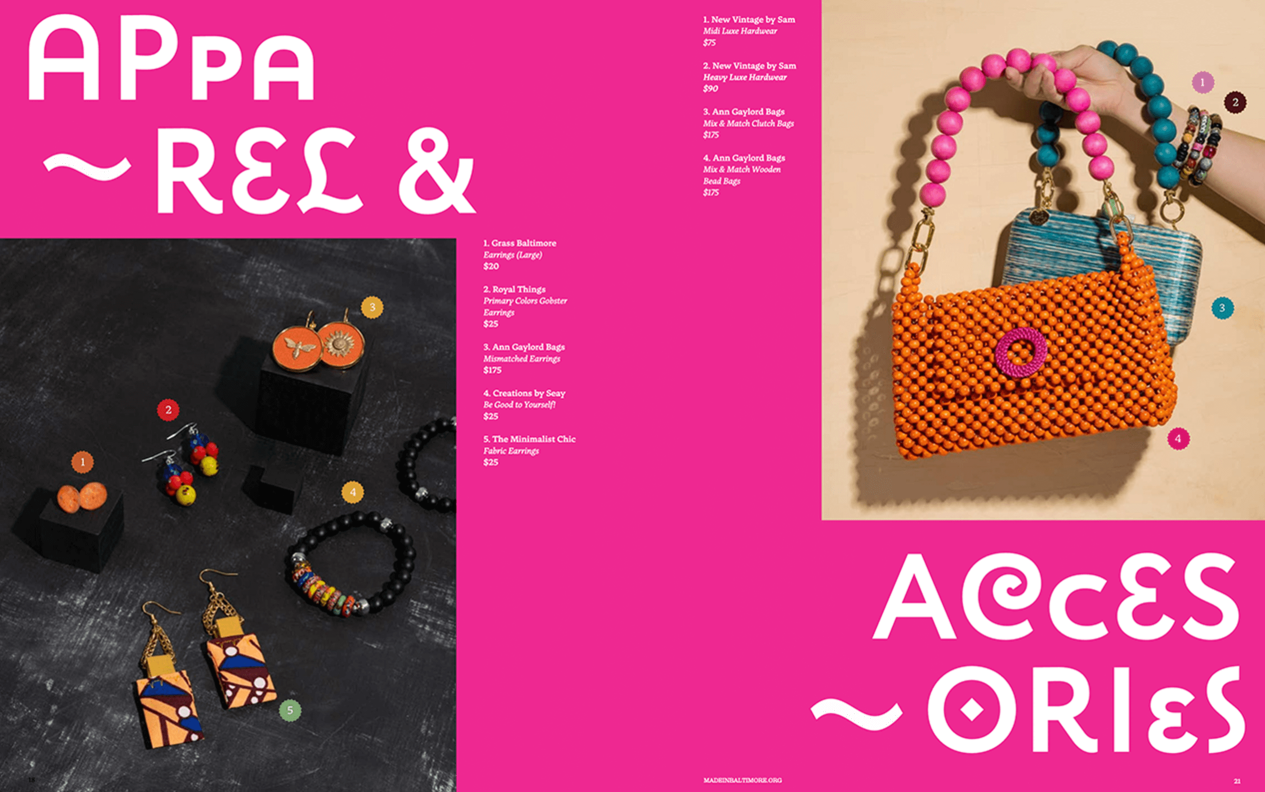
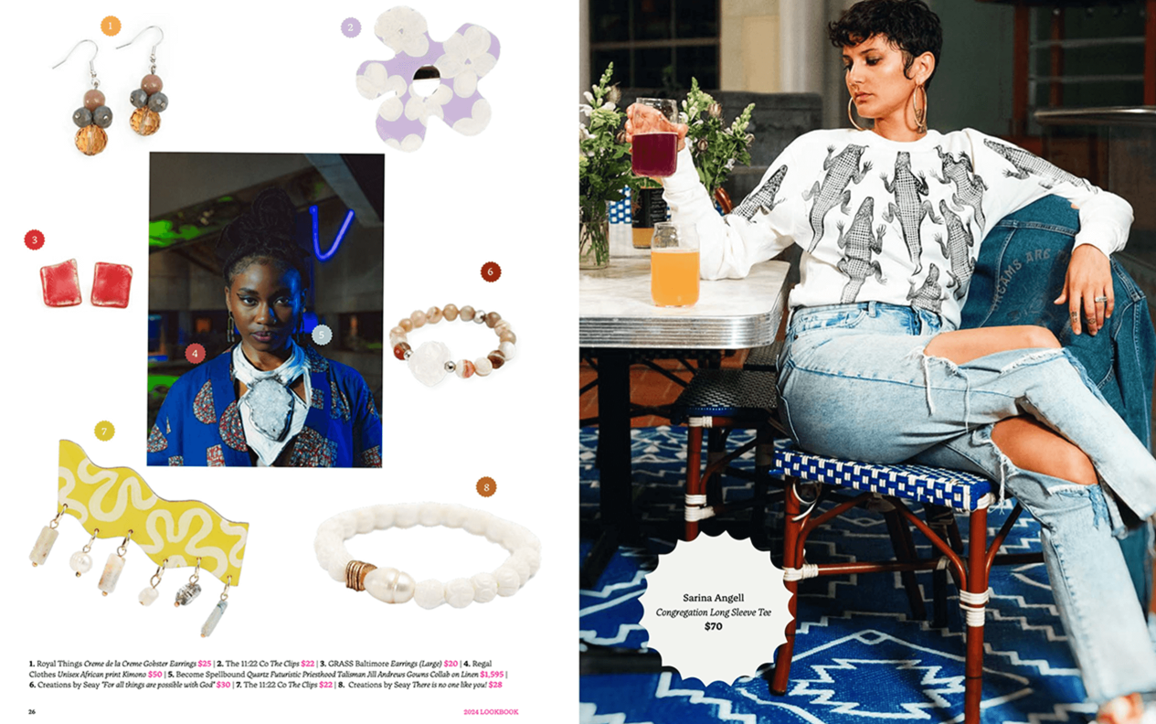
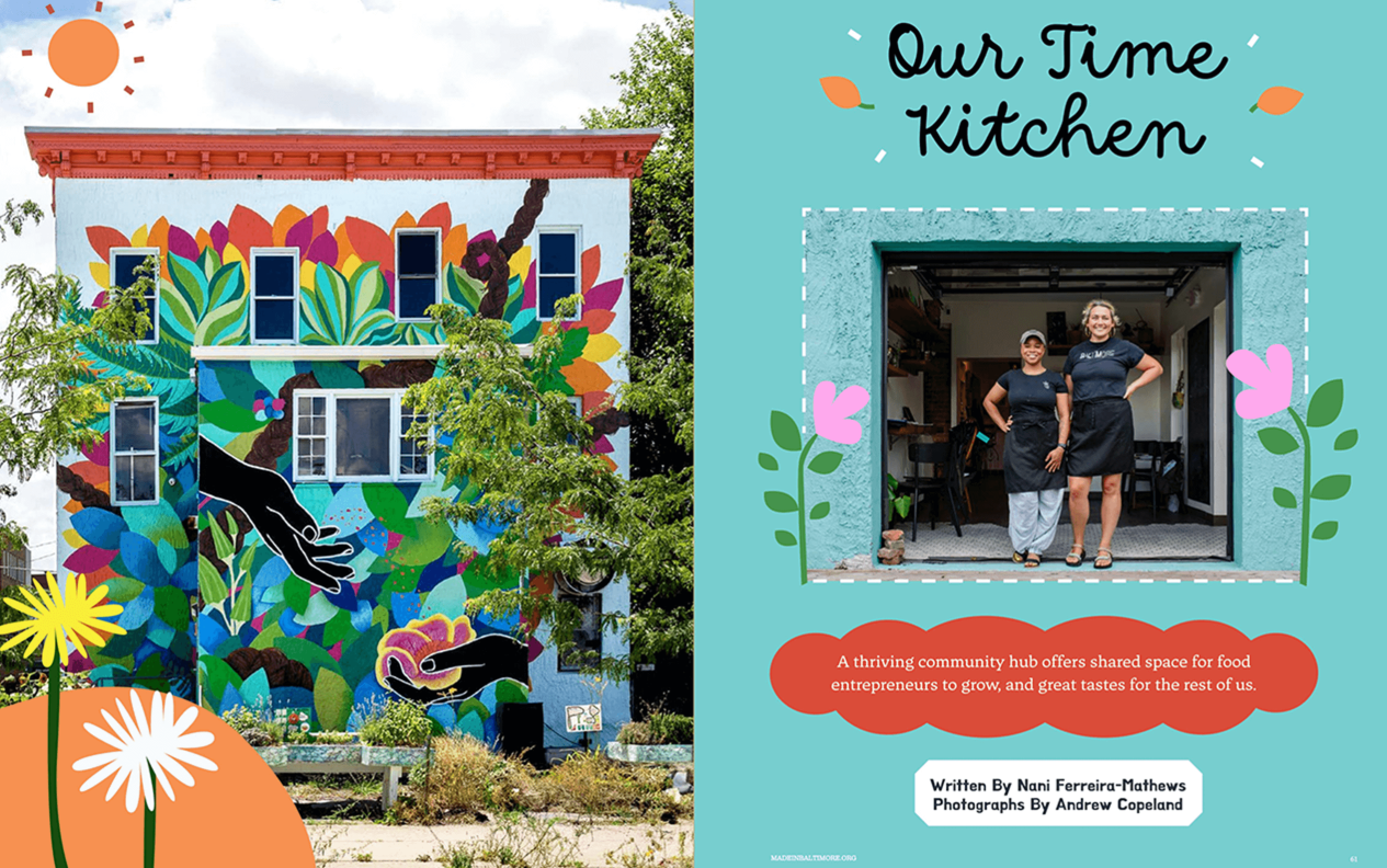
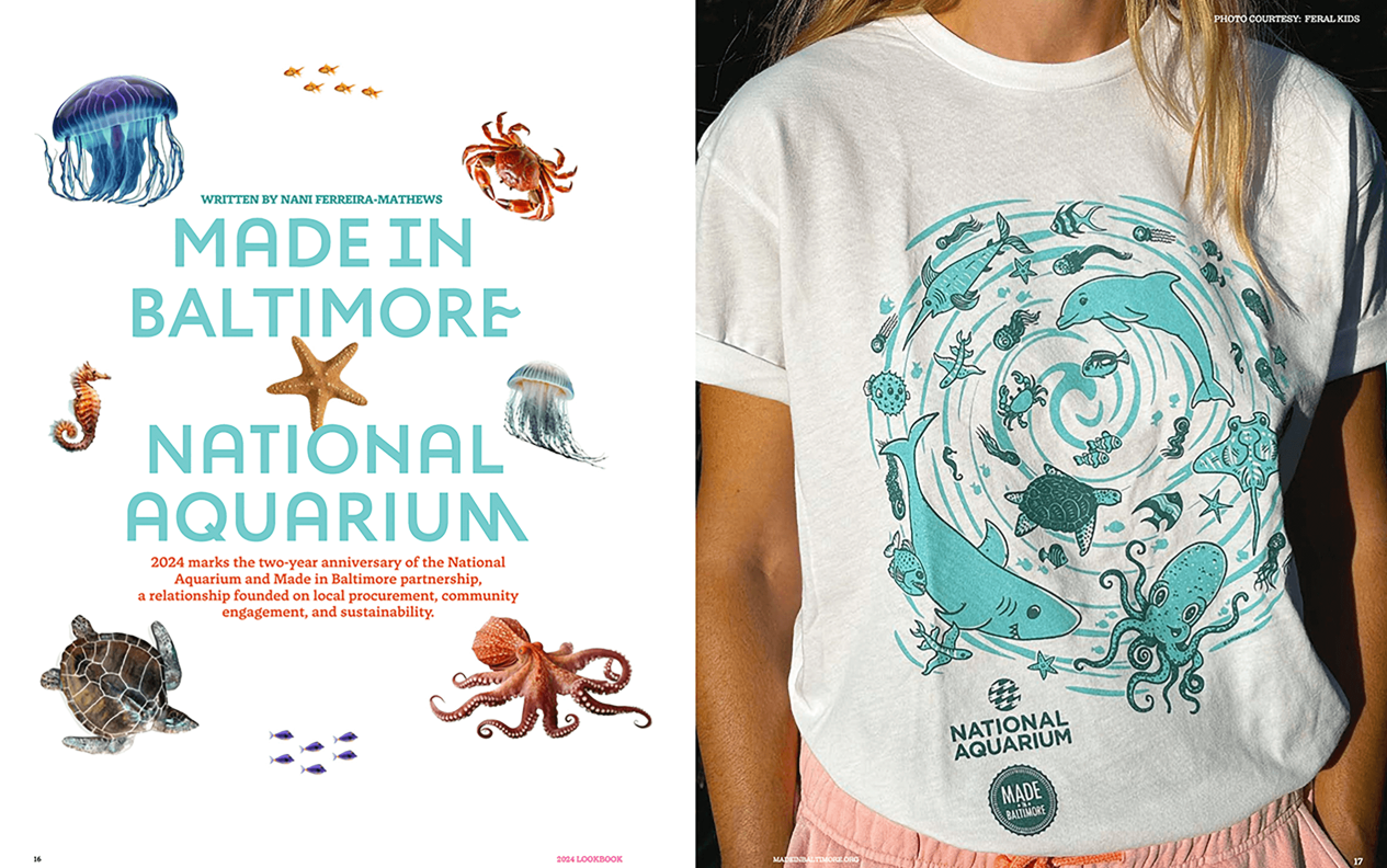
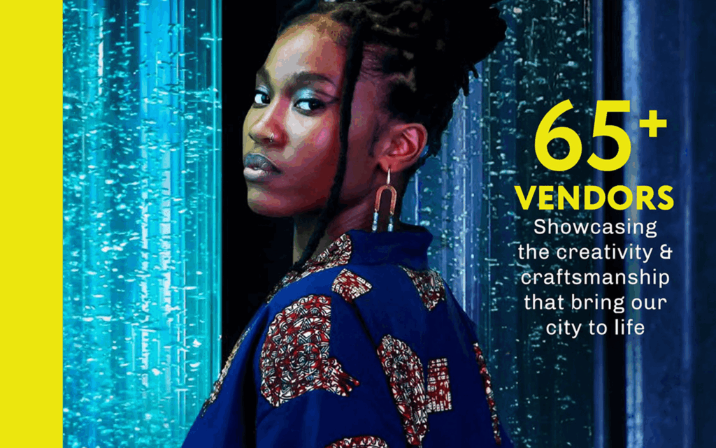
When the Made in Baltimore team set out to create their biannual Lookbook, they envisioned more than just a catalog – they wanted to build a movement. Faced with the challenge of coordinating 65+ local makers and 10 creative consultants, the team developed a meticulous production process anchored in community collaboration. The result was a stunning, editorial-quality publication that balanced diverse creative voices with cohesive design, transforming what could have been a simple product guide into a compelling showcase of Baltimore’s creative economy.
The impact was immediate and far-reaching. The Lookbook’s success was measured not just in impressive digital metrics, but in tangible business outcomes for Baltimore’s artisan community. Its global reach surprised even the organizers, with engaged readers in 10+ countries spending an average of 5 minutes 34 seconds immersed in the digital version – an eternity in publishing terms. Local retailers began using it as a sourcing guide, leading to new wholesale opportunities for featured makers, while city officials praised its professional presentation as validation of Baltimore’s growing creative economy. The Lookbook’s greatest achievement may have been how it strengthened connections within Baltimore’s maker community itself, fostering cross-promotion and collaboration that extended far beyond the printed page. By giving home-based businesses and emerging brands the same polished presentation as established retailers, the Lookbook not only documented Baltimore’s creative scene, but also created a powerful platform for economic growth and community pride that resonated from neighborhood shops to international audiences.

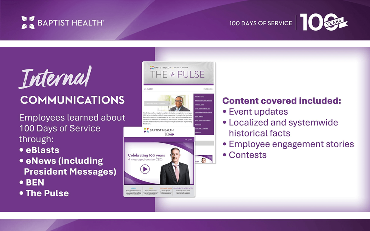
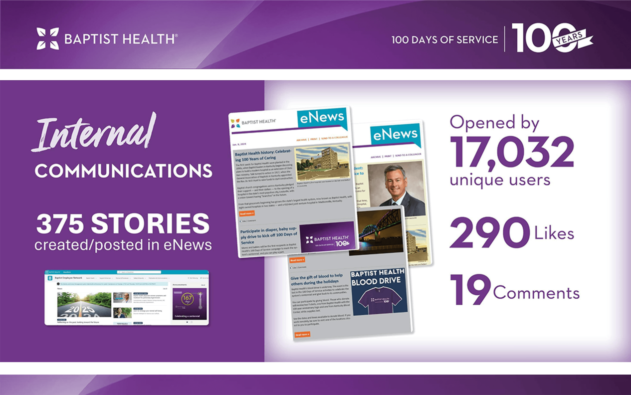
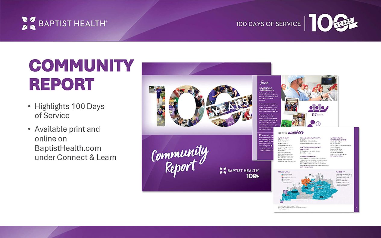
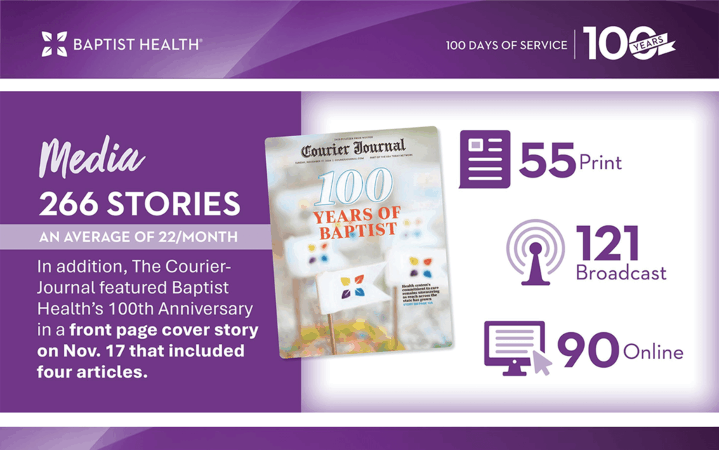
In 2025, Baptist Health transformed its 100th anniversary into a powerful demonstration of community care through its “100 Days of Service” campaign. Each hospital in their network hosted monthly health screening initiatives and donations that collectively, touched over 11,000 lives. The campaign masterfully balanced nostalgia with forward-looking energy, achieving record-breaking engagement that shattered healthcare industry standards. Local media amplified these efforts with 266 stories celebrating Baptist Health’s legacy, while internal participation soared. Beyond the numbers, the initiative proved how purpose-driven healthcare marketing works – by meeting communities where they live, whether through blood drives that collected 350 units or volunteer efforts that cleaned 258 bags of trash from neighborhoods. By weaving storytelling, data, and grassroots action into every facet of the campaign, Baptist Health didn’t just commemorate history, it reinforced its position as Kentucky’s preferred healthcare provider for the next century.

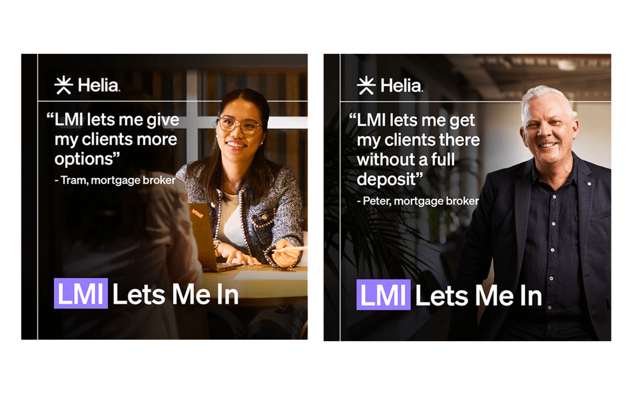
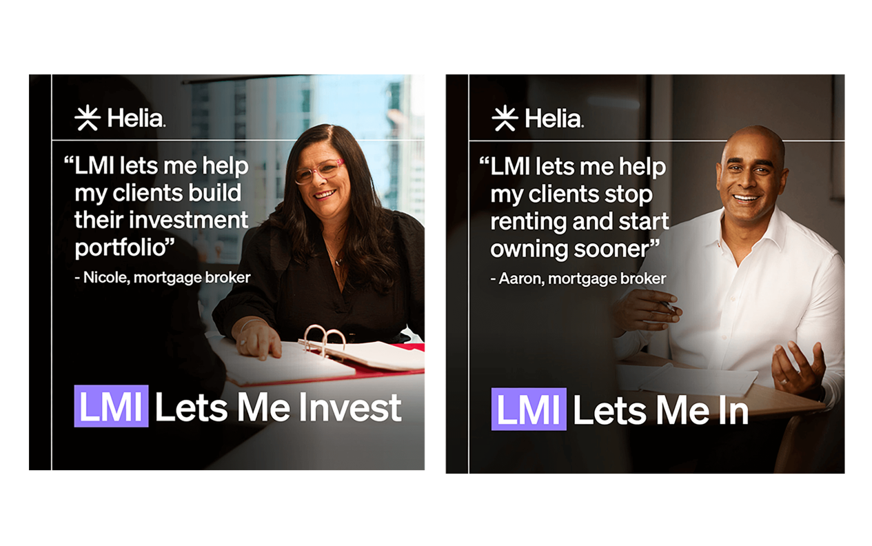
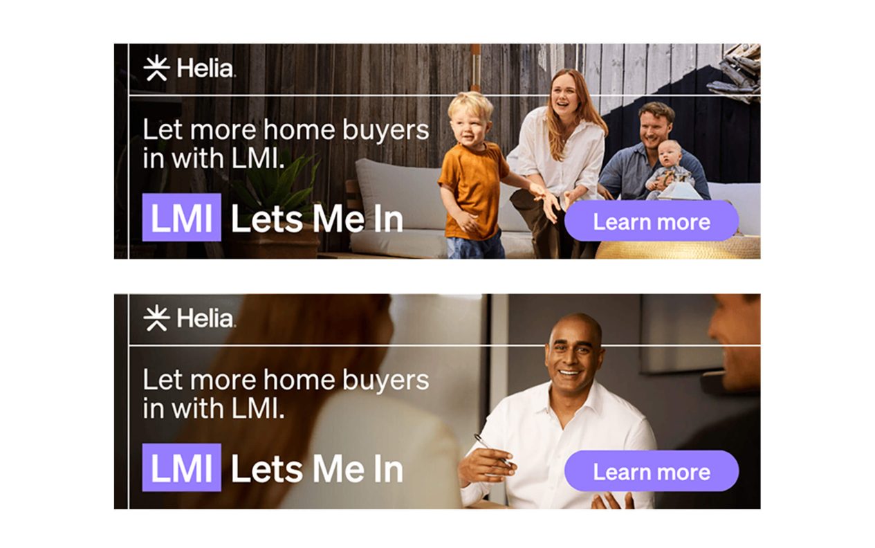
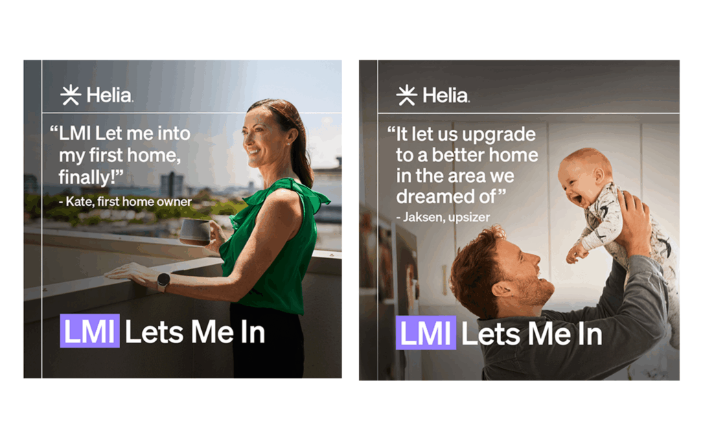
Australia is experiencing a housing affordability crisis. Saving the required 20% deposits feels impossible and the “Bank of Mum and Dad” is tapped out. Helia’s “LMI Let’s Me In” campaign aimed to transform the view of Lenders Mortgage Insurance as a last resort into a powerful first choice. The campaign tackled entrenched broker hesitations (99% awareness but low confidence in recommending) and buyer misconceptions (viewing LMI as pure cost rather than opportunity) through three masterstrokes:
Firstly, a linguistic wordplay reframed the LMI acronym into an aspirational mantra; “Lets Me In”. Secondly, Broker tools and training enabled them to shift conversations earlier in the homebuying journey. And lastly, human proof points featured real mortgage brokers and buyers demonstrating how 5% deposits could stop rental cycles and start generational wealth building.
The campaign’s surgical focus on mortgage brokers – gatekeepers influencing 75% of loans ensured maximum impact, with trade media engagement soaring above benchmarks and Google Search CTRs surging as brokers actively sought LMI information. By anchoring the transformation in authentic stories rather than product specs, Helia didn’t just run a campaign, they sparked an industry mindset shift where LMI became synonymous with possibility rather than compromise.
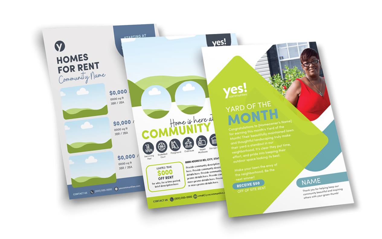
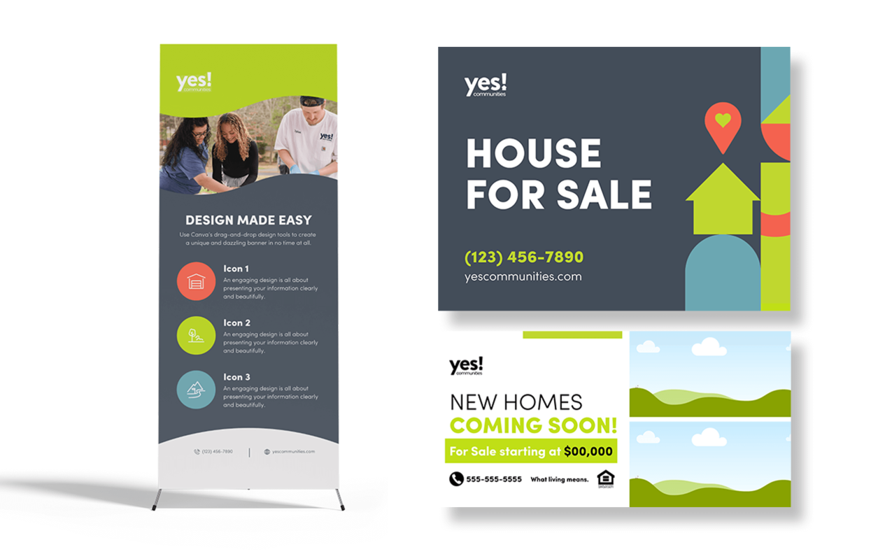
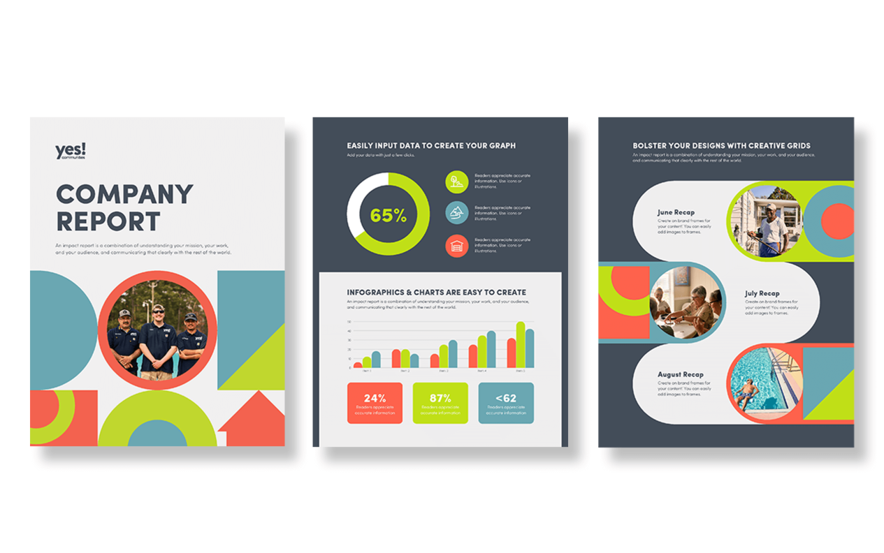
YES Communities is a vibrant, people-first brand offering affordable, quality manufactured homes in safe, well-maintained neighborhoods. This design work embodies the brand’s values of clarity, warmth, and trust. Rooted in modern simplicity, the work transcends traditional corporate aesthetics to foster genuine connections – both with homes and the people who inhabit them.The collateral is cleanly designed to balance utility and emotion, from functional signage like home listings to resident-focused initiatives like ‘Yard of the Month’. Visually, the work combines generous white space with geometric motifs and a vibrant-yet-soft palette, resulting in a modern system that feels both structured and inviting.
The result is a brand experience that feels welcoming yet polished, mirroring the supportive ethos of the communities it serves. From banner stands to printed reports to in-community awards, every touchpoint reinforces a sense of pride and cohesion.
This campaign doesn’t just market properties, it cultivates belonging.